

10 resources you can use to analyze and visualize survey data

Data analysis and visualization techniques I’ve used to help ecomm brands, agencies, and Fortune 500s extract value from survey data.
The techniques
Use shipping addresses to measure your brand’s geographic footprint
Replicate the “Duplicate of Purchase Law” to reveal brand preference in your category
Analyze demographics by zip code, MSA, and state to optimize your OOH campaigns
Use Census.gov data to visualize your TAM and key segments
Use US Bureau of Labor Statistics spending categories to benchmark customer spending
See if starting a family correlated with product adoption in your category
Estimate customers’ age and gender from their first names
Build FAQ pages based on a shopper’s self-reported barriers to purchase.
Add some quant rigor to your qual-heavy segmentation
Ask shoppers why they choose one brand over another
How to use this guide
This guide is for brands, agencies, and consultants looking to understand their market better through data-driven insights. It offers techniques, visualizations, Keynote slides, datasets, Google Docs links to survey questions, and research methods to help you “do” your consumer insights work.
The techniques include leveraging shipping addresses, analyzing demographic data, and using external datasets like Census.gov and the US Bureau of Labor Statistics.
Most of the visuals and datasets—both structured and unstructured—featured in the guide are available for download. The visuals come with editing options, so you can customize them according to your specific needs.
Enjoy.
👇
#1
Use shipping addresses to measure your brand’s geographic footprint
If you’re an ecomm brand, you’ve got sales data.
This is a powerful way to leverage that dataset.
The map shows sales data from over 350,000 orders for an e-commerce brand. I mapped each order's ZIP code to its corresponding core-based statistical area to show the percentage of total orders relative to the population of each area.
It helped the client assess their geographic penetration leading up to a brand awareness campaign (confirming their intuition that their reach was strongest on the coasts.)

Resources & Links
Zip Codes w/corresponding CBSAs (paid packages)
The Map (Reusable)
CBSA by population
#2
Replicate the “Duplication of Purchase Law” to reveal brand preference in your category
This analysis replicates the "Duplication of Purchase Law," as popularized by Byron Sharp in "How Brands Grow."
It shows how mass market brands tend to sell to the same customer base with few skews from the category norm. Does this pattern hold in your category? Or is it more segmented? Use this analysis to find out.
The data from this example comes from 149 shoppers answering the question, “Which of the follow non-alcoholic beverage brands have you drank in the last few weeks?”

Resources & Links
Non-Alcoholic Beverage Survey Data
Table with Heatmap (Reusable)
#3
Analyze demographics by zip code, MSA, and state to optimize your OOH campaigns
Social Explorer is great for visualizing a wide array of demographic data.
They provide “thousands of interactive data maps going back to 1790,” but I’ve found it most useful for tracking where people move as they age.
In the example above, you can see shifts in age demographics by census tract — specifically college graduates in Atlanta moving from campuses to urban neighborhoods. This analysis was particularly beneficial for a client conducting out-of-home advertising across Southern cities.
Resources & Links
The Map
Social Explorer (Free & paid options)
#4
Use Census.gov data to visualize your TAM and key segments
I typically begin reports and presentation with custom square pie charts to help viewers grasp the scale of their market and identify key segments.
The key aspect is using Census data to visualize the base population and total addressable market. For instance, for a client in the smart thermostat industry, I use Census.gov to determine the number of U.S. households (131 million) and those with an annual income of at least $50,000 (84 million). I layered on top of these datapoints a key result from a survey we conducted: the percent of households within their TAM with a smart thermostat, which translated to roughly 39 million.
(Note: creating these visuals involves a few minutes of manual work to color the squares in Keynote. Previously, I synced my spreadsheet with Tableau, which automatically generated the visual. However, I prefer the flexibility of Keynote The few minutes spent manually refining the chart is worth it.)

Links
Households & Families Pop (US Census)
Household by Annual Income (US Census)
Square Pie Chart for Households (Keynote file you can download & edit)
Spreadsheet for visualizing TAM for households (Google Sheet for download)
#5
Use US Bureau of Labor Statistics spending categories to benchmark customer spending
If you're reading this, you’re interested in how shoppers spend money. A helpful thing you can do to categorize expenditures using the 14 classifications established by the US Bureau of Labor Statistics. Incorporating these categories into your surveys can illustrate how individual spending aligns with or diverges from the average household.
I’ve used this data alongside survey questions about spending habits, financial insecurity, and savings strategies to show how as young adults age and their earnings increase, this boost in income doesn't necessarily equate to financial security.
Among the three households types—single, married without kids, and married with young children (under 6)—married individuals with young children spend nearly twice as much annually compared to those in single households.

Links
The Table (Reusable)
Structured Data (Google Sheets for download)
Annual Consumer Expenditures, 2022 (US Bureau of Labor Statistics)
#6
See if starting a family correlates with product adoption in your category
Many brands track significant life transitions as shoppers move from their 20s to their 30s, such as increased disposable income and homeownership. However, one of the most profound changes is starting a family.
This chart shows the percentage of women aged 18-30 who have had at least one child. The pink line represents data from a survey I conducted for a fitness brand, illustrating the positive correlation between fitness app usage and having kids.
I've found this chart useful for several brands. It can be a great way to show the relationship between having kids and using new products.

#7
Estimate customers’ age & gender from their first names
Many e-commerce brands understand their customers well but often lack detailed age data. While tools like Google Analytics provide some insights, extracting precise age details can be tough.
However, your sales data should include customer first names, which you can use to estimate age.
This approach is particularly useful for determining whether respondents in a customer or post-purchase survey reflect your overall customer base.
The dot plot (above) shows 17 names randomly selected from a database of over 100,000 first names on social security cards dating back to 1881.
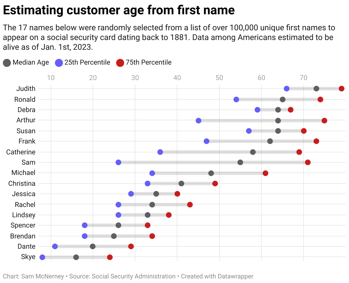
Links
Actuary Table (Social Security Administration)
First Names (Social Security Administration)
Namsor (Free & paid options)
The Dot Plot (Reusable)
#8
Build FAQ pages based on shopper’s self-reported barriers to purchase
This one isn’t an “analysis” for survey data. It’s a survey technique for collecting data.
It’s designed for e-commerce founders and marketing VPs of brands ~0-2 years old. You can use to create an FAQ page for under $500 in a single day.
Using a survey, recruit a sample of shoppers from your market, expose them to your product, and ask them these three questions.
The results will include “conversion barriers” that you can use (with a text-based AI assistant like ChatGPT) to build your FAQ page.
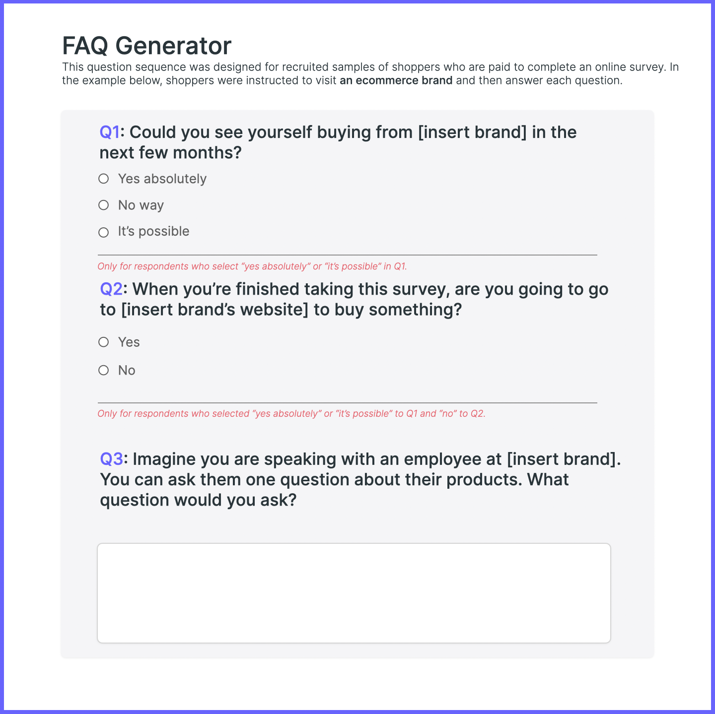
Links
Question Sequence (Google Doc)
#9
Add some quant rigor to a qual-heavy segmentation
One thing you can do to “naturally reveal” existing segments is visualize data from two survey questions (I’ll get to those in a second).
This method will provide a solid foundation for your qual insights.
So you can bring each segment to life.
And avoid excessive guesswork or metric-hunting.
The crucial step is identifying the "central rub" in your category.
For health and fitness, this might be contemplating if you’re going to exercise tomorrow or not.
For personal finance, it might be having to check the balance in your primary bank account.
Find internal conflict.
A behavior that people contemplate, worry about, or dwell on.
From there, measure that behavior with two survey questions that ask about:
• Frequency: "How often do you….”
• Emotion: "What's your typical reaction when you…”
Then, to visualize the data and identify your segments, plot each response in a table.

Links
Table with Heatmap (Reusable)
The Two Survey Questions (Google Doc)
#10
Asking shoppers why they choose one brand over another
Need to speak with shoppers who can clearly explain why they choose one brand over another?
There’s a survey question you can use to do that.
It assumes that most shoppers can’t clearly say why they choose one brand over another, and focuses instead on those who can.
I call it the “do-you-have-a-specific-reason?” question, and it looks like this:
Is there a specific reason you use Venmo vs. Cash App?
Is there a specific reason you run with Nike vs. Adidas?
Is there a specific reason you use Tide vs. Persil?
Most people will select “no," which is the point. You want to take everyone who selects “yes” and ask, “So what’s the reason?”
Have ChatGPT analyze their written responses, then visualize the output.

Links
Square Pie Chart (Keynote file you can download & edit)
The Survey Questions (Google Doc)

Sam McNerney
Founder, McNerney Insights & Marketing