How I lost $1,600 in respondent fees by asking a “Dress Question.”
Sometimes -- whether in chess or Geoguessr -- you win by not losing, or at least by knowing what not to do.
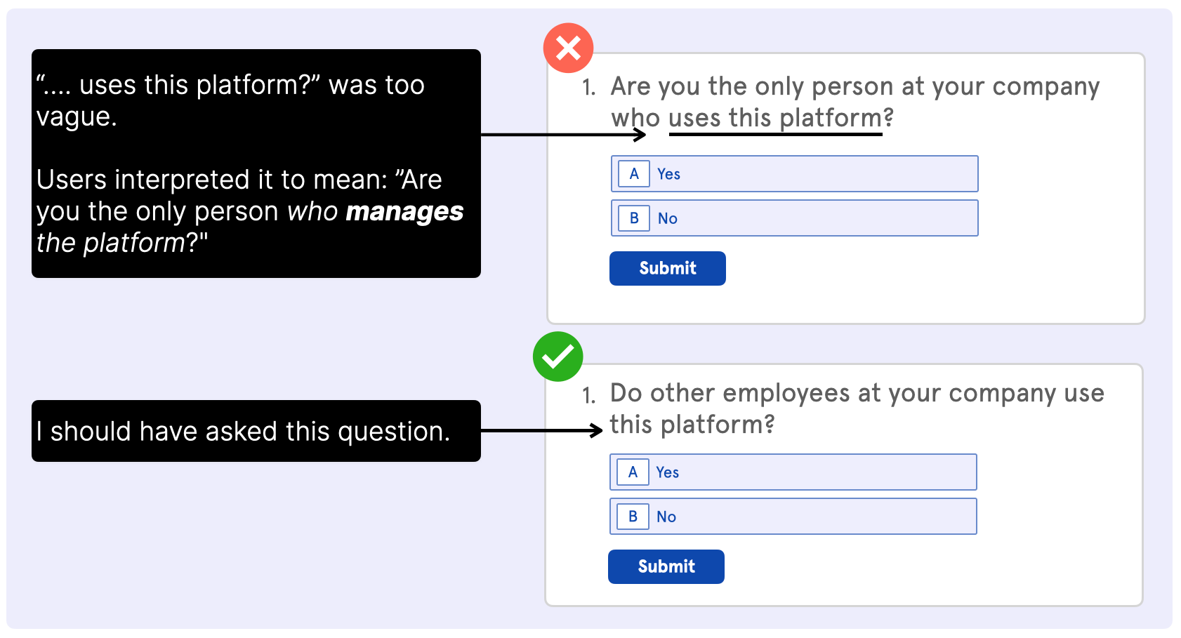
A while back, I asked users of a SaaS platform:
"Are you the only person at your company who uses this platform?"
Many said "Yes."
Simple, right?
Apparently not.
The client shared data with me, showing that most of these individuals were NOT the only users at their companies.
Digging a little more into the result, I realized my mistake.
Users interpreted the question to mean, "Are you the only person who manages the platform?"
What failed me was an issue that comes up a lot in surveys: Dress Questions
Dress Questions are questions you read one way without realizing there’s another meaning – just like “the dress,” which appeared white and gold to some and blue and black to others.
(Remember that viral craze?)
Fortunately, we used respondents' unique IDs to correct the data.
Finding and fixing only one error was reassuring, like a football team being penalized only once in a game they easily win.
But it wasn’t luck.
Over the years, I’ve made several very stupid survey mistakes, including:
• Forgetting to remove a line of CSS that shrank text boxes, forcing me to rerun the entire survey and shell out an additional $1,600 for the sample.
• Forgetting to include a "prefer not to say" option in a household income question for subscribers of The Economist. Their readers were not happy….
I could go on.
Based on my mistakes I've created a "pre-survey checklist."
Planning to do a survey? Follow the checklist and you'll avoid burning your list, wasting respondents fees, and pissing off your client and their customers.
Peer Review: Do you know anyone who can read? Have your colleagues, friends, or family complete the survey.
It doesn’t matter if they’re outside the intended demographic.
Afterwards, ask them if anything was confusing and how they interpreted each question.
Live Feedback: If possible, get on a live Zoom call with users/customers and ask them to take the survey. Again, ask if anything was confusing and how they interpreted each question.
User Trial: Run the survey with a small group (n=50) of real users/customers and do a mini analysis with the data. If everything looks good, you’re good to go.
If you’re emailing a list of subscribers, this step will also help you gauge complete rates – which are typically around 5% – so you know how many subscribers you need to email.
Next Steps
Worried about “Dress Questions” in your survey?
Need a fresh set of eyes to ensure clarity?
Get a Roast and receive nuanced design tips.
https://www.sammcnerney.com/survey-roast
Cheers,
Sam
PS: The most interesting part of “the dress” is that it almost didn’t go viral. The debate began when a bride-to-be received a photo of the dress from her mother.
What if the bridge had seen it as black and blue, just like her mother?
What if her mother had walked by the dress without taking a picture?
The dress doesn’t warrant Matrix-level questions about the nature of reality. It’s just an optical illusion. But the subsequent debate does reveal a fundamental point about survey design: a question that seems clear to you might mean something entirely different to the respondents.
PSSS: Do you play Geoguessr? Send me a friend request. My username is WeValueYourFeedback.


